SHORT DESCRIPTION
Mobile e-Learning App to prepare for safe tours in the snowy mountains.
CONTEXT
Mobile User Interface – BA Course
CONTRIBUTORS
Alec Nikolov
CONTRIBUTION
Concept, Graphics
PARTNERS
WSL Institute for Snow and Avalanche Research SLF
The WSL Institute for Snow and Avalanche Research SLF commissioned us to redesign the e-learning environment of White Risk – a tool to prepare for safe tours in the snowy mountains.
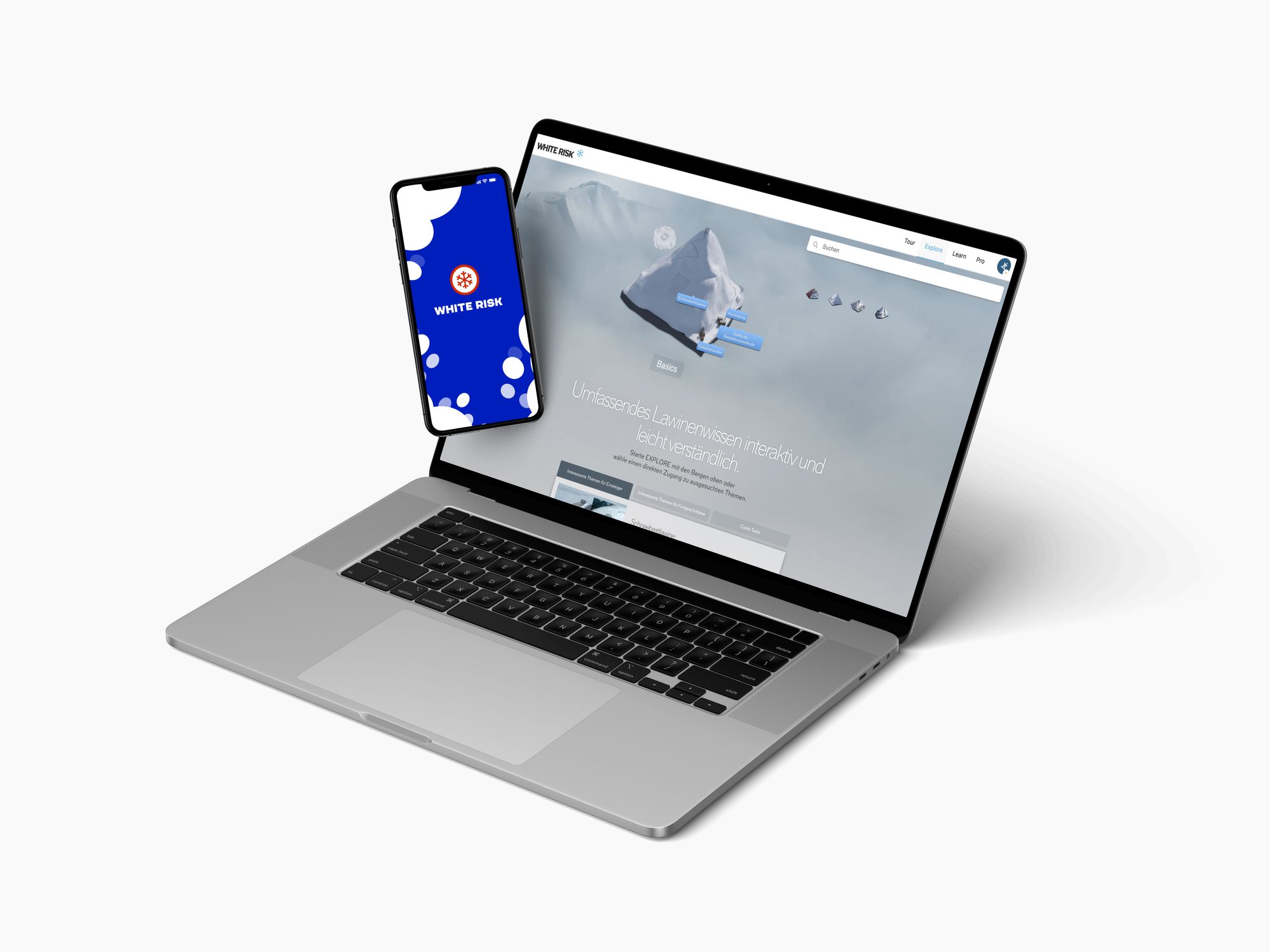
The online platform impresses with a range of well-prepared content. However, there is a lack of structure and the lessons could be more appealing.
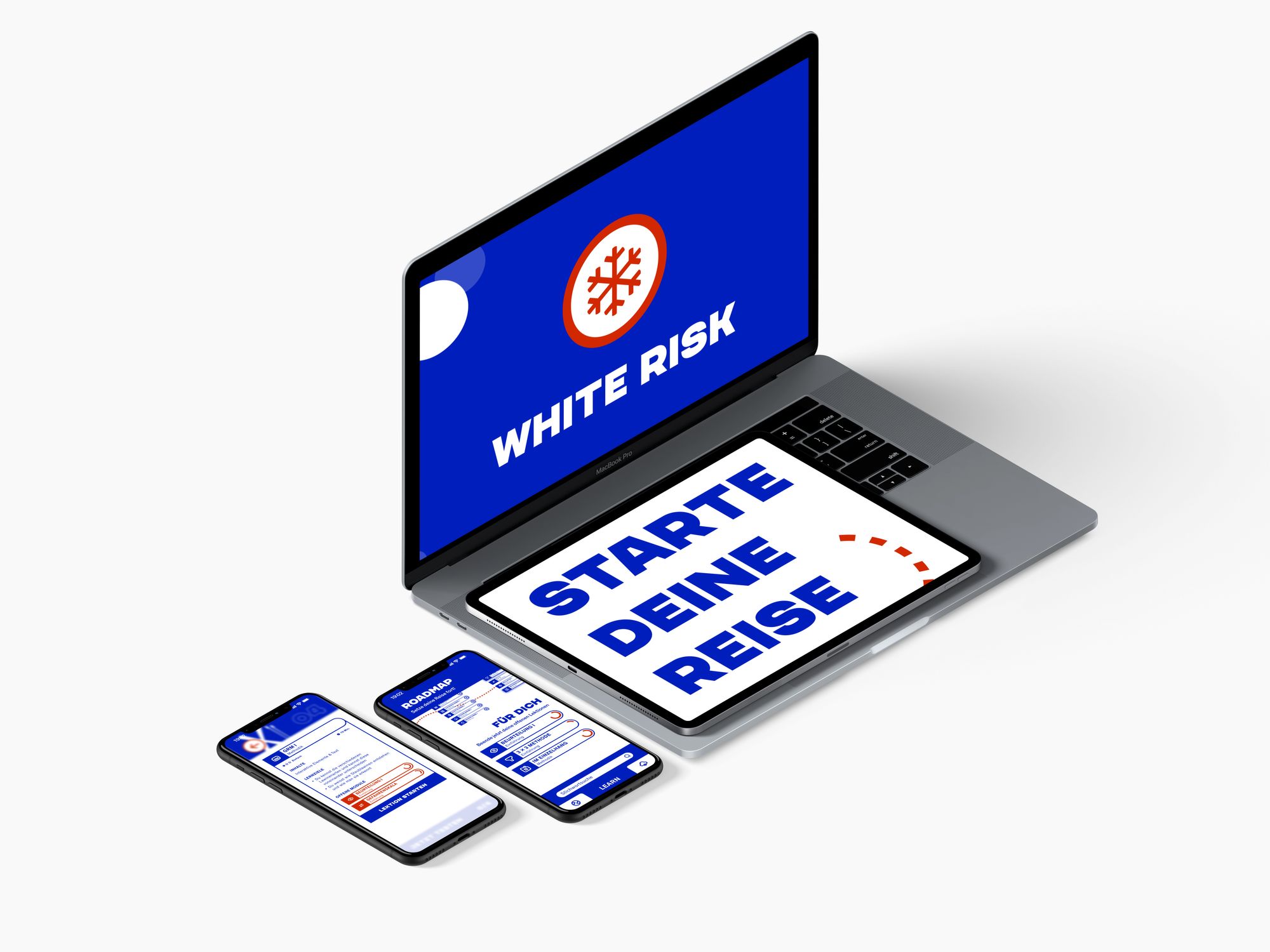
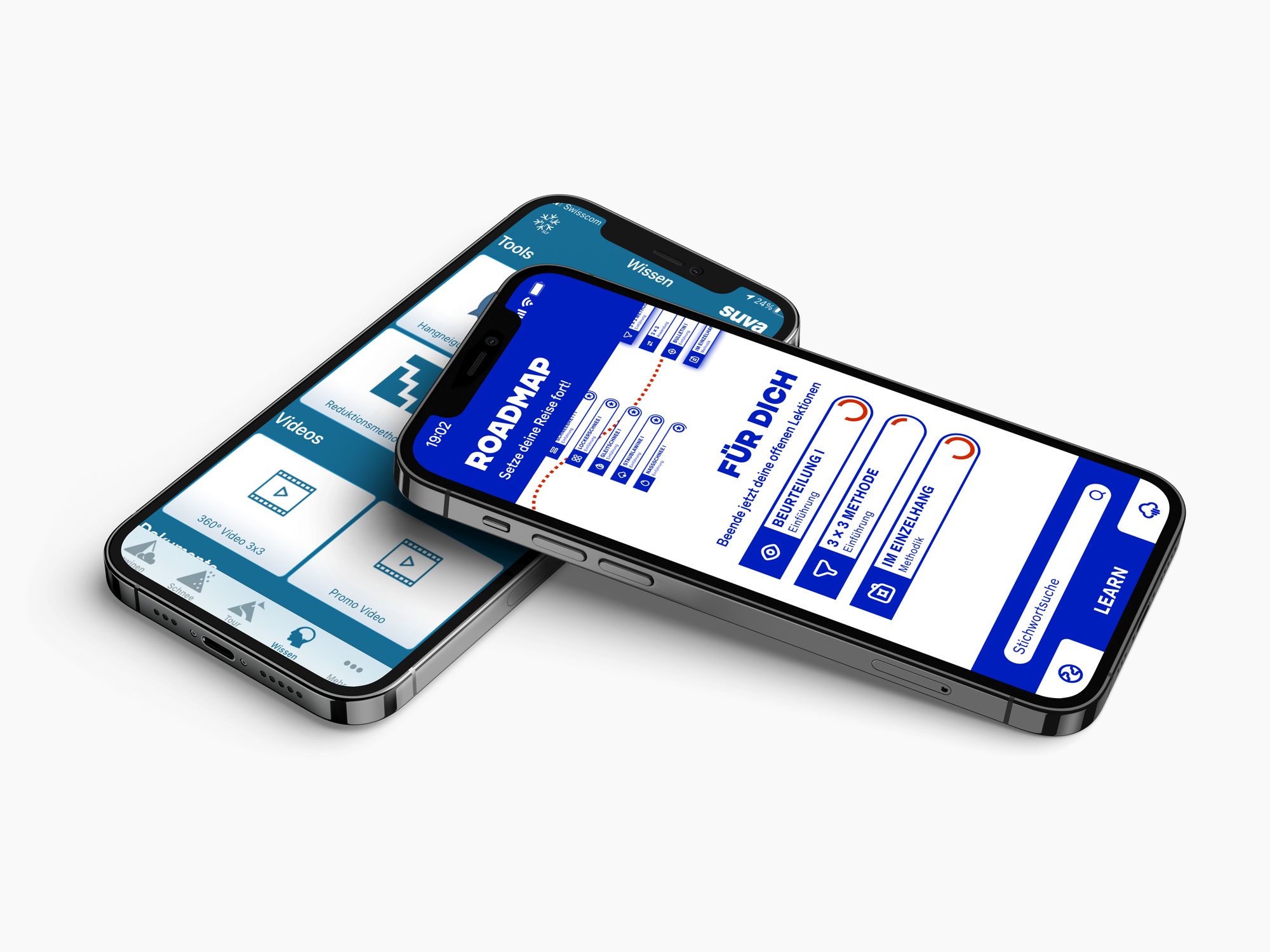
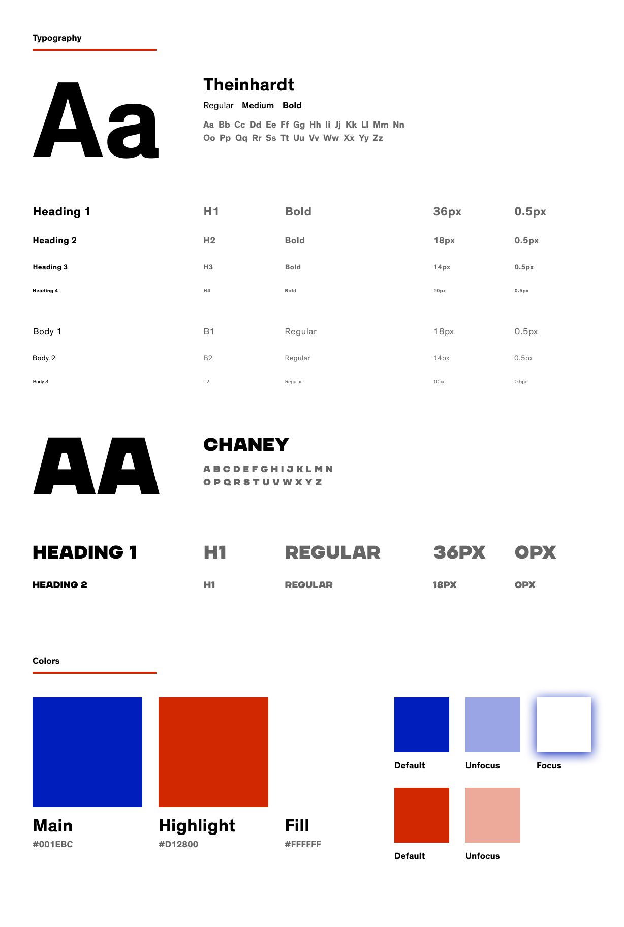
My design approach addresses this problem by considering a new structuring of the content with a corresponding design of the user interface. All this is rounded off with a rebranding of the White Risk appearance.
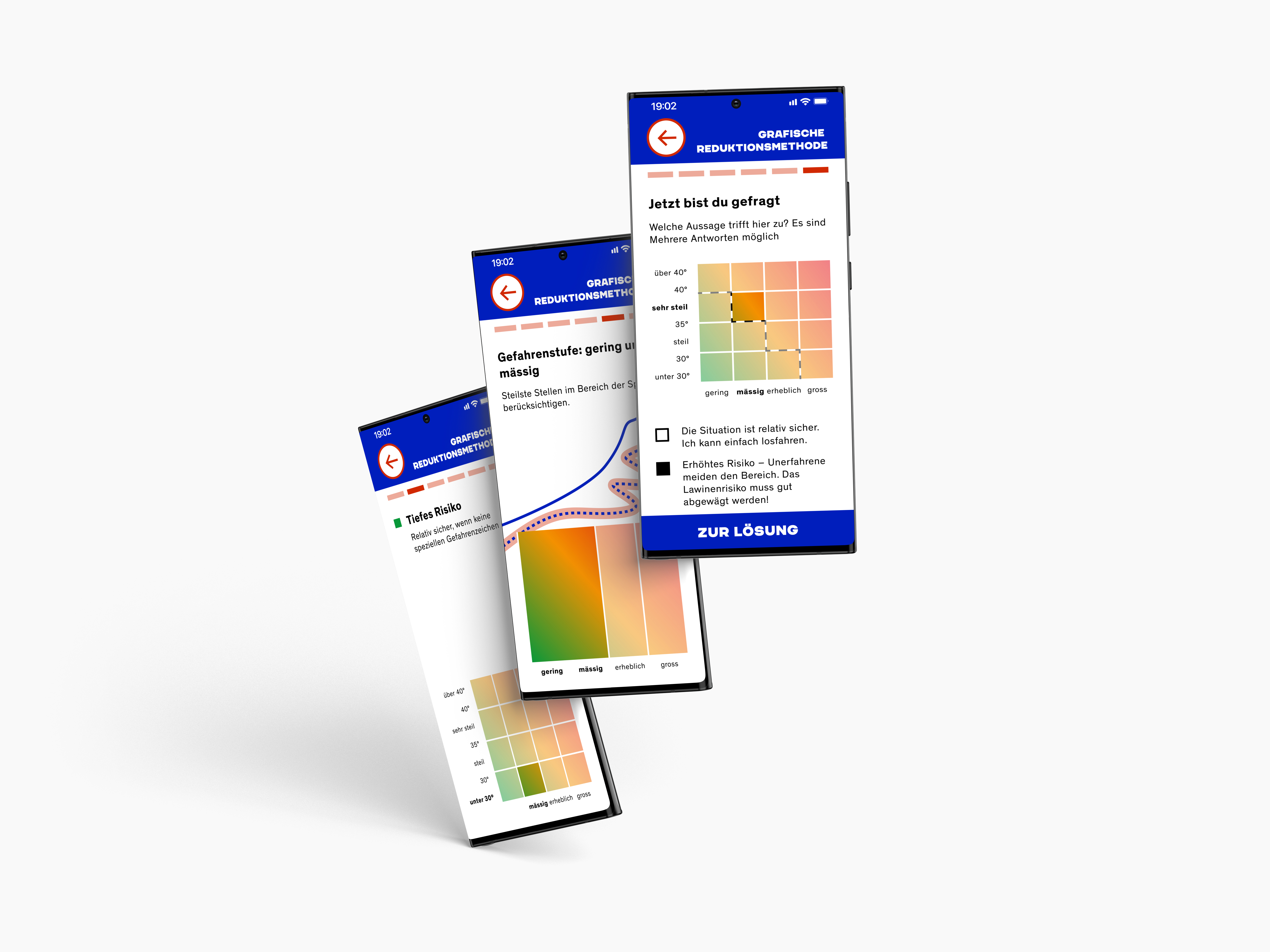
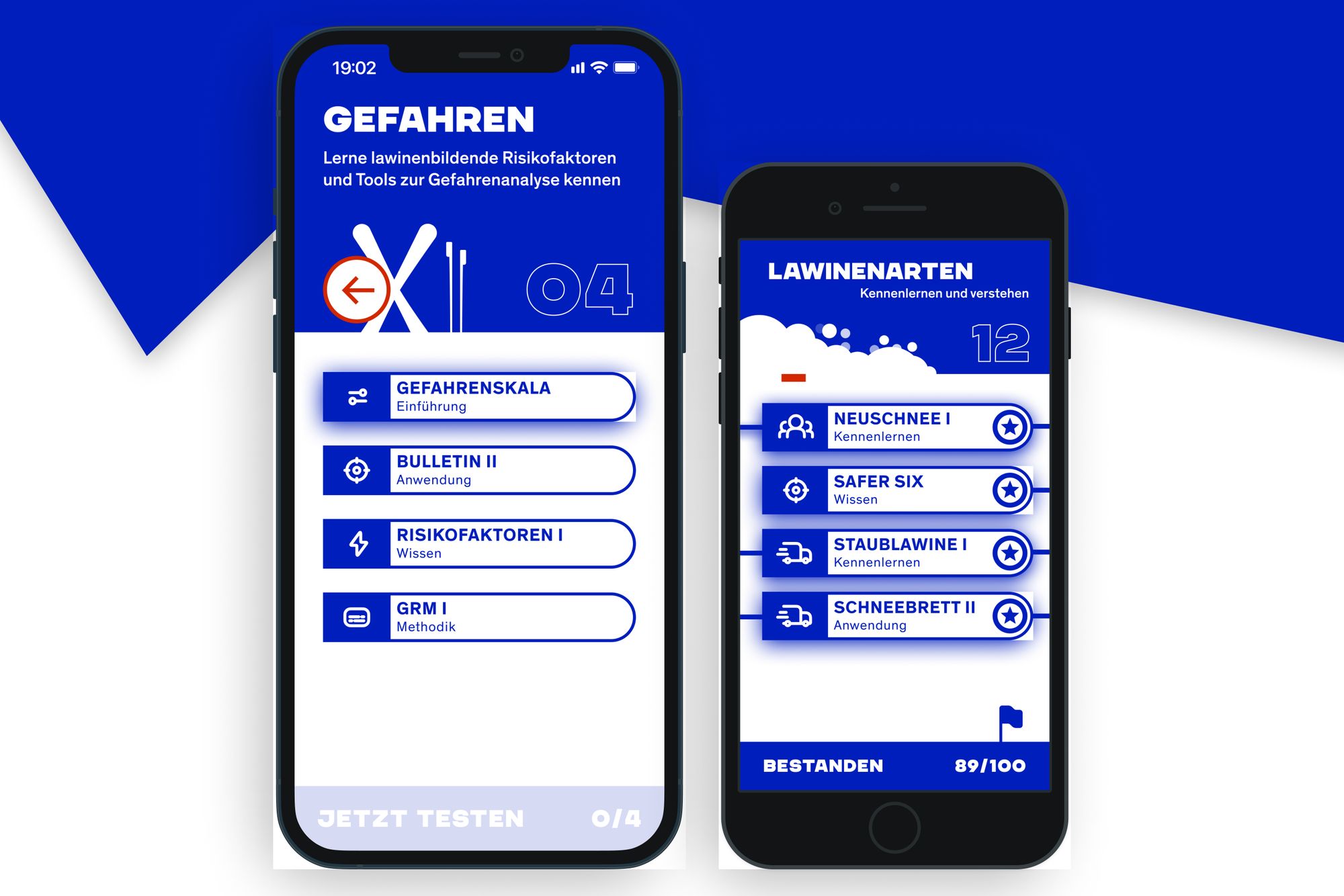
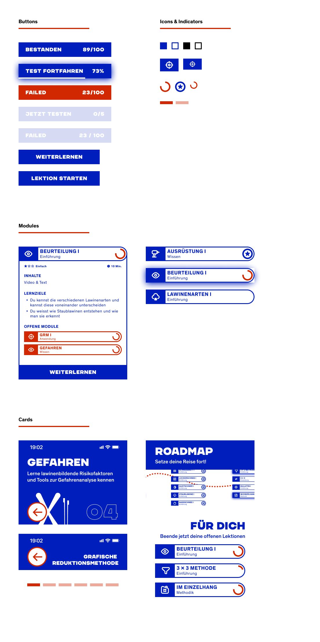
Short & Compact Lessons. Step by step lessons for quick success experiences with a test of your learnings at the end of each session.
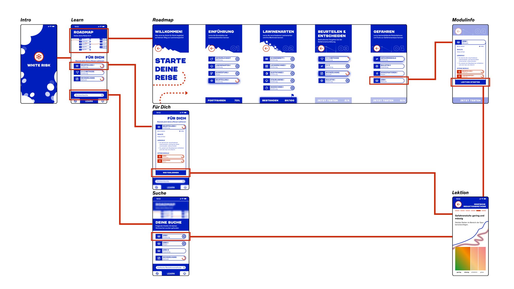
Flow Diagram – Get to your lessons the way you want to. Follow your roadmap that prepares you for your trips step by step or finish your lessons in progress. You can also search for specific content you're interested in by entering keywords in the search section.
